
Unfortunately, the perfect gray paint does not exist…however the right gray does – but it will take you about 10 paint samples in order to find it though, unless you are lucky. Sorry to burst your bubble.
So my search for the right gray for our living room is hopefully over (I just have to compare it to our curtain sample before purchasing). We moved in a little over a month ago, and at the time I slapped a sample on the wall that I thought would be perfect. However as time went on I kept seeing purple (and I am not a purple fan). So that gray (SW Pewter Cast) was out.
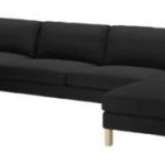
Next, I searched on pinterest for grey rooms I liked that provided their paint choice, so I tried Martha Stewarts Flagstone Grey. It was similar in color, however had more browns in it versus a purple undertone. I also tried Benjamin Moore Rockport Gray after I had seen it in Young House Love’s room. Also, once we got the massive Ikea Karlstad sectional in the Sivik dark grey in there we realized we should go lighter on the walls to provide contrast.
Then I pinterest searched some more, got some sample and kept getting them all wrong… too brown or too purple. I honestly thought it would just be swatches of gray on my wall forever. I finally took a look at all my swatches again and came back to one I had picked up a long time ago. Its a lighter gray with a bit of brown too it, but a blue/green undertone as well – it also worked well with the color of the couch and the mustard yellow in our throw pillows.
I got a sample and was so excited to finally find the right grey. I painted it on the walls and it was soo blue and I was sad. Then the lightbulb came on…I realized it was most likely the yellow walls surrounding the swatch and peeking out behind it that was causing this illusion. There is a color theory I learned back in my graphics color class, that colors look different when they are next to other colors. So then, I tried painting in on the white stairway wall that the sellers never painted. It was then perfect…. If only I had realized that before.
So here is the gray we are going with. Sherwin Williams Mindful Gray – however we’ll get it in Behrs Paint + Primer because we’ve had so much success so far with that stuff. Covers in one coat no joke and I know I don’t want to be painting this room’s massive walls more than once!
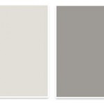
 Also, part of the process included taking a photo of the swatches and painting the wall in photoshop. Here was my quick attempt to visualize it. Though…. I still think it’s not quite right in the photo – it’s much brighter and lighter.
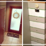
 Here is our process of slapping samples on the walls… can’t wait to get rid of all the patchwork!


Update: I just had a genius thought. So on the Sherwin Williams screenshot above of the paint color I picked out, there lists a hexadecimal color value – something you can input into Photoshop. When I inserted the Mindful Gray value number, it gave me this lovely color:

Can you see that yellow undertone?! LOVE – because that is the other main color I’m looking to use. Soo my advice to you… When you find a grey you like, plug the hexadecimal value into photoshop and you’ll see the underlying color that will most likely show up on your wall depending on lights. If its a purple… run for the hills, unless that is your thing.


Hi how did you get it in the other paint? What’s it called? Thanks, it looks great!
Yes, I have the exact same question. I want to use the Behr paint but maybe the Mindful Gray color…is there a Behr paint that matches it or do you bring the info from Sherwin Williams to Home Depot? Are you still happy with Mindful Gray?
Home Depot usually has other brand’s formulas, or if you bring in a swatch they can color match it.
It’s a great gray. I’ve noticed it shows up purple-ish in some lights, but usually is great. I’ve posted updated photos since too…
I feel your pain. I too have been trying to find the perfect grey and your right it doesn’t exist. I had more patchwork on my bathroom walls that I finally got sooo confused and maybe even a little color blind. Everyone of the paint samples looked blue or purplish to me and blue was the last thing I wanted in my master bath. Other people would say it looked grey to them so I was convinced I was colorblind and just went with what I thought might be best. I ended up using what looked the most grey on the wall patch. It didn’t work work out so good. I put down my grey access rugs and the walls became more blue. Blue in the sunlight and blue at night with the lights. I just gave up at that point and decided to leave it and when I change I will just go back to plain ole white. White always looks white.